During this lesson we went to the postal museum in Bath in order to learn things about postal topics such as stamps, due to the fact that our next project is to create 6 stamps based on Bath as a city. Wewere spoken to about the history of mail and how it all started, for example that royal mail was the only legal postal service from certain times.
The designs of some of the stamps that were in the postal museum were inspiring and made a good influence on what i wanted to do for my stamps, such as flower stamps that were there, the way the stamps were only taking up part of the flower image was a good idea and the bright colours that were used brought out the image of the stamp and made more of an appeal to me.
Sunday, 1 November 2009
Tuesday, 6 October 2009
Print types and Artists who use them
Relief Printing

Intaglio
Planographic

Stencil

Andrew Warhola (Andy Warhol) is one of the artisits that uses stencil prints in his work, he is famous in art for such pieces as the alternating Marilyn Monroe images, and the tomato soup image.

In this Andy Warhol artwork he has taken the image of Mickey Mouse and repeated the image into four square making one larger square. The images themselves have had three colors added to them orange purple and blue and all of these are bright colours, which i think may help to attract the eyes of a passer by.
Banksy is a famous graffiti artist that has created plenty of memorable images for people to see such as a teddy bear throwing a molotov at some police officers or a maid sweeping things under the carpet.
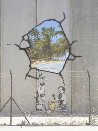
This picture is of one of banksy's works that is over seas, the setting for this graffiti was on a wall that seperated to countries from each other. The image is there to show people that what is on the other side could be better than they think. This kind of political statement is regularly seen in banksy's art, and some find this work offensivewhilst others marvel at its messages.
Intaglio
Planographic
Stencil
Andrew Warhola (Andy Warhol) is one of the artisits that uses stencil prints in his work, he is famous in art for such pieces as the alternating Marilyn Monroe images, and the tomato soup image.
In this Andy Warhol artwork he has taken the image of Mickey Mouse and repeated the image into four square making one larger square. The images themselves have had three colors added to them orange purple and blue and all of these are bright colours, which i think may help to attract the eyes of a passer by.
Banksy is a famous graffiti artist that has created plenty of memorable images for people to see such as a teddy bear throwing a molotov at some police officers or a maid sweeping things under the carpet.
This picture is of one of banksy's works that is over seas, the setting for this graffiti was on a wall that seperated to countries from each other. The image is there to show people that what is on the other side could be better than they think. This kind of political statement is regularly seen in banksy's art, and some find this work offensivewhilst others marvel at its messages.
Lesson Review 02/10/09
During this lesson i was making a back ground and a banner/header for my blog both of which i used photoshop to make both, firstly i made my background which consisted of the image that i used for my intaglio print. Using the image that i used for my intaglio print i made a brush in photoshop which i used to duplicate the same image just in different colors.
The banner/header that i created was just made up of three pictures that i had that came from good times that i had, had during the last year. I adjusted the size of the three pictures in order to fit them all in and then i faded them and added the title.
As well as these main tasks that i completed we were set some tasks to do with the use of photshop and getting used to using the tools that photoshop has to offer such as the 'magic wand'. During these little practise tasks i found some difficulty but then over came these difficulties through repeating attempts at the tasks.
Monday, 28 September 2009
File Formats
where to use where not to+ bad things good things + examples
JPG- this is the method that is most commonly used for the compression of photographic images/pictures. Where as jpg isn't very good in the case of textual imagery, a bad thing about jpg is that when the image is stretched it will blur because the between each of the pixels the color that is meant to be used is guessed and put in.

GIF- Graphics Interchange Format should be used in logos which can consist of short animation based clips. A gif should not be used in the general use of digital photography due to the limited coloring. The good thing about this format is that due to its selection of solid coloring in each frame available in the animations. A bad point though is that gif format can not be used to reproduce digital photography because of it limited color scheme.
PNG- Portable Networks Graphics is a bitmapped image format which uses lossless compression, it can be used in imagery that is meant to have transparency which would get rid of the white line that may surround an image. PNG should not be used unprofessional graphing due to not supporting color spaces. A good thing about PNG is that it allows transparency in pictures, but a bad point is that it is not designed for professional graphics.
TIFF- Tagged Image File Format, this file format is used to store images like photographs. A good point about a TIFF file format is that they are supported by many image manipulation programs, but a bad point about TIFF formatted files is that it hasn't really been updated since 1992.
SVG- Scalable vector graphics, it is a family of formats that is used for describing 2D vector graphics. A bad point about SVG is a open standard that has been underdevelopment since 1999, and a good point is that SVG files can simply be made and edited by any text editor program.
JPG- this is the method that is most commonly used for the compression of photographic images/pictures. Where as jpg isn't very good in the case of textual imagery, a bad thing about jpg is that when the image is stretched it will blur because the between each of the pixels the color that is meant to be used is guessed and put in.
GIF- Graphics Interchange Format should be used in logos which can consist of short animation based clips. A gif should not be used in the general use of digital photography due to the limited coloring. The good thing about this format is that due to its selection of solid coloring in each frame available in the animations. A bad point though is that gif format can not be used to reproduce digital photography because of it limited color scheme.
PNG- Portable Networks Graphics is a bitmapped image format which uses lossless compression, it can be used in imagery that is meant to have transparency which would get rid of the white line that may surround an image. PNG should not be used unprofessional graphing due to not supporting color spaces. A good thing about PNG is that it allows transparency in pictures, but a bad point is that it is not designed for professional graphics.
TIFF- Tagged Image File Format, this file format is used to store images like photographs. A good point about a TIFF file format is that they are supported by many image manipulation programs, but a bad point about TIFF formatted files is that it hasn't really been updated since 1992.
SVG- Scalable vector graphics, it is a family of formats that is used for describing 2D vector graphics. A bad point about SVG is a open standard that has been underdevelopment since 1999, and a good point is that SVG files can simply be made and edited by any text editor program.
Publishing Review 25/09/09
During this lesson i managed to get some good work done with some intaglio prints, which involves inking up then wiping down a plastic plate and then printing onto a sheet of soaked fabricated paper. We also did lino prints with the lino that we had cut out in the publishing lesson the week before.
We also scanned on our work that we had done in our publishing lessons onto the Macs so that we can edit it if we want to and some of it may be to be used on our blogs that we have made in e-media lessons. We scanned the our work on using a scanner and Adobe Photoshop CS2 which i found to be a useful program.
We also scanned on our work that we had done in our publishing lessons onto the Macs so that we can edit it if we want to and some of it may be to be used on our blogs that we have made in e-media lessons. We scanned the our work on using a scanner and Adobe Photoshop CS2 which i found to be a useful program.
Monday, 21 September 2009

Wk3: HTML
Today our lesson was centered around learning how to write HTML, first we practiced different types of HTML coding. We then wrote HTML that allowed us to put a picture onto our blogs and we also made a link to a separate website through text in a blog that we made.
This lesson caused frustration due to the fact that some of the HTML were really space sensitive, so if there was one space to many it can be messed up. But then after sorting out any errors the HTML is built up of letters and signs such as which would make the text bold, or which would put the text into italics.
Element- are indicators to the web browser on how the document should be read/ understand
Tags- these are little bits of code that can alter the text somehow e.g. bold
Formatting- is the format in which the text is put such as;
Attributes-these provide extra information about the elements, and these generally come in a name/value partnership.
Links- are something that can be embedded into the text that the HTML builds up and can allow movement to another site that is linked.
Frames- these allow you to display more than one Web page in the same browser window.
Tables- Allow information to be presented in a table and these tables will have to be built up in the HTML cell by cell with formatting as well as information.
This lesson caused frustration due to the fact that some of the HTML were really space sensitive, so if there was one space to many it can be messed up. But then after sorting out any errors the HTML is built up of letters and signs such as which would make the text bold, or which would put the text into italics.
Element- are indicators to the web browser on how the document should be read/ understand
Tags- these are little bits of code that can alter the text somehow e.g. bold
Formatting- is the format in which the text is put such as;
This is subscript and superscript
, which means that part of the text is lowered.Attributes-these provide extra information about the elements, and these generally come in a name/value partnership.
Links- are something that can be embedded into the text that the HTML builds up and can allow movement to another site that is linked.
Frames- these allow you to display more than one Web page in the same browser window.
Tables- Allow information to be presented in a table and these tables will have to be built up in the HTML cell by cell with formatting as well as information.
Subscribe to:
Comments (Atom)